Founder field note
Sales Page Template for Early-Stage SaaS Founders
Use this sales page template to explain your SaaS offer, answer buyer objections, add credible proof, and guide early adopters to one clear next step.
A sales page template is a fill-in structure for explaining who your software helps, what outcome it supports, why a buyer should trust the claim, and what to do next. Use the worksheet below to draft one focused page, then adapt its proof and call to action to your stage: a pre-launch product needs a different next step from a tool that is ready for paid customers.
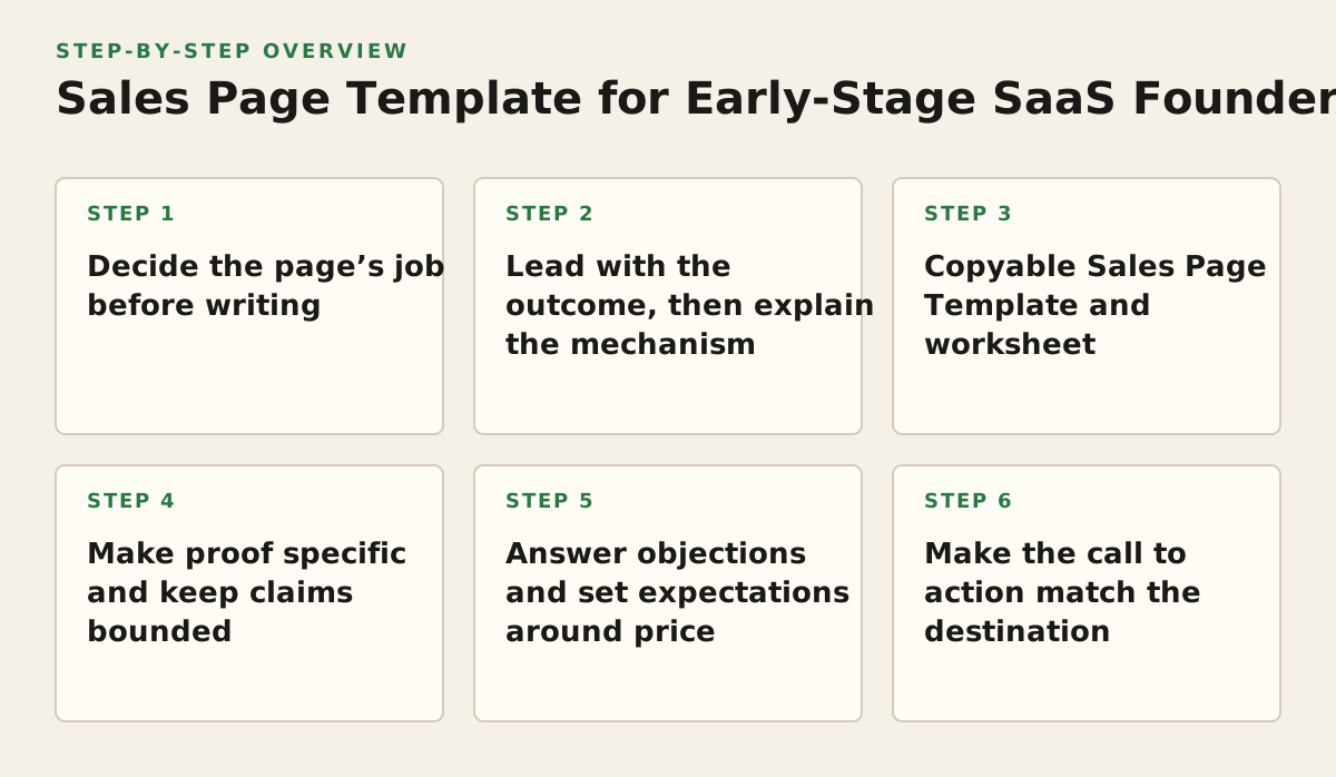
1. Decide the page’s job before writing
Use this when your homepage is trying to serve investors, users, job candidates, and curious visitors all at once. A sales page should help one primary buyer make one decision. That decision might be to start a trial, request a demo, join a waitlist, or purchase; choose the action that your product can actually support today.
Why it works: a defined audience gives every section a test. If a sentence does not help that buyer understand the offer, assess fit, or take the next step, it may belong elsewhere. Google Ads’ landing page guidance similarly emphasizes relevance to the ad or search and a useful, navigable destination; see Google’s landing page experience guidance.
Choose a narrow buyer and moment
“Small businesses” is too broad to guide a page. Name a role and a situation: for example, “solo consultants who need to send a proposal after a discovery call.” If the product serves several audiences, write separate pages only when their problems, proof, or next steps meaningfully differ.
- Buyer: who feels the problem and can act on it?
- Trigger: what event makes solving it important now?
- Decision: what single step should this page support?
Failure mode: choosing “get more signups” as the page job before confirming that the product is ready for signups. Implementation example: an AI meeting-notes tool still in private development can ask a qualified visitor to join a waitlist; it should not imply instant access if access is not available.
2. Lead with the outcome, then explain the mechanism
Use this when your draft opens with a feature list, technical architecture, or a broad promise such as “work smarter.” Start with the buyer’s desired progress, then show how the product helps produce it. Keep the claim within what the product can demonstrate.
Why it works: a buyer needs to recognize their problem before evaluating your implementation. A useful message pattern is: “For [buyer] dealing with [situation], [product] helps [outcome] by [mechanism].” This forces the copy to connect a specific user, problem, and product capability rather than presenting a feature as self-explanatory.
Turn features into a verifiable chain
For each feature, write the steps between capability and benefit. A scheduling tool’s “availability rules” might let a consultant block preparation time, which can prevent clients from booking over it. The feature is the rule; the benefit is the protected work time. Do not jump from that feature to an unsupported claim about revenue or productivity.
- Write the feature in plain language.
- Name the task it changes.
- State the outcome the buyer can reasonably expect.
- Remove any result you cannot substantiate or qualify.
Failure mode: claiming “never miss a lead” when the software only sends reminders. The FTC says advertising claims must be truthful and not misleading, and that advertisers need support for objective claims; review its advertising and marketing guidance. Implementation example: change “never lose a lead again” to “get a reminder to follow up when a lead has no recorded next step,” if that accurately describes the product.
3. Copyable Sales Page Template and worksheet
Use this template when you need a first draft for a new SaaS product or a focused landing page. Fill each row before polishing headlines. It works because the prompts establish audience, offer, evidence, and action in a sequence. Failure mode: filling the page with polished but interchangeable claims. Replace placeholders with details a real buyer could recognize.
Copy this worksheet
| Page element | Prompt or question to answer |
|---|---|
| Audience and moment | Who is this for, and what situation makes them look for a solution? |
| Headline | What useful outcome does the product help this buyer achieve? |
| Problem | What does the buyer currently do, and where does that process break down? |
| Product mechanism | What does the product do that changes the process? |
| Benefits | What are two or three practical consequences of using that mechanism? |
| Proof | What can you show or verify that supports the claims on this page? |
| Fit and limits | Who is a good fit, and what does the product not do or not yet support? |
| Next step | What should a qualified visitor do now, and what happens after they do it? |
Filled example and adaptation
Example: “For independent consultants who lose track of proposal follow-ups, NudgeDesk organizes each prospect’s next step in one queue. Add a prospect, set a follow-up date, and review the queue before your next work session. You can see a sample workflow before joining the early-access list. It is designed for solo consultants, not sales teams that need a shared pipeline. Join the list to request early access.” This is a hypothetical example, not a claim about an existing product.
Adapt the fields to your product’s actual state. If users can start immediately, make the next step direct and explain what happens after signup. If you are pre-launch, say so and describe the waitlist or access request accurately. For proof, use only material you have permission to share and can substantiate; do not fill an empty proof field with invented testimonials.
4. Make proof specific and keep claims bounded
Use this when your page asks a buyer to trust an unfamiliar founder or a product without an established reputation. Proof does not have to mean a customer quote. A clear demo, a sample output, a transparent explanation of how a feature works, or a founder’s relevant experience can help a visitor assess the claim.
Why it works: concrete evidence lets a buyer evaluate what the product actually does instead of relying on adjectives. Match each proof item to the claim beside it: a screenshot can show an interface, but it does not by itself prove a productivity outcome. Label samples accurately and distinguish current capabilities from planned work.
- Use a product capture to show a real workflow.
- Use a case example only with permission and an accurate account of the customer’s experience.
- Use a founder note to explain a relevant problem or design decision, not as a substitute for evidence.
- State limitations where they affect fit, such as supported use cases or early-access status.
Failure mode: displaying a polished mockup as if it were a working product screen. Implementation example: label it “concept preview” and pair it with a short description of what is functional today. This keeps the page useful to early adopters while avoiding a misleading impression.
5. Answer objections and set expectations around price
Use this when a qualified buyer may hesitate because of setup effort, product maturity, migration, privacy questions, or unclear cost. Put the most consequential objection close to the relevant claim rather than hiding every caveat in a footer. A sales page cannot settle every buyer’s review, but it can prevent avoidable ambiguity.
Why it works: buyers need to judge both value and fit. For a bootstrapped product, honest boundaries can be more useful than broad assurances: explain what onboarding involves, what data the tool needs, or whether a feature is still planned. Do not claim certifications, security controls, integrations, or service levels unless they are verified and available.
Build an objection block from real questions
Collect questions from conversations, support messages, and product interviews. Group them by the decision they affect, then answer with a direct fact or a clear next step. If you do not know the answer, say what is known and how the buyer can confirm the rest.
- Effort: What does setup require from the user?
- Fit: Which workflow or team size is supported?
- Risk: What should the buyer know before moving information into the tool?
- Cost: Where can they see current pricing or request a quote?
Failure mode: presenting “contact us” as the answer to every practical question. Implementation example: if setup currently requires importing a spreadsheet manually, state that plainly and show the expected file format only if it is documented. If pricing is not settled, do not invent a price; explain how an interested buyer can learn the current terms.
6. Make the call to action match the destination
Use this when visitors arrive from a launch listing, search result, founder post, or email. The page should continue the promise that brought them there. A headline about trying a product should not lead to a form that silently requests a sales call; a waitlist button should not imply immediate access.
Why it works: the button’s wording and the next screen together establish what happens. Use a verb that names the action—such as “Start a trial,” “View the demo,” or “Join the early-access list”—and explain any important consequence nearby. The W3C guidance on link purpose emphasizes that people should be able to determine a link’s purpose from its text or surrounding context.
For discovery traffic, make the page self-contained: visitors may not know your founder story or product category. Keep the first screen focused on the buyer, outcome, and action. Nielsen Norman Group’s guidance on concise, scannable web writing recommends structuring web content for scanning, which is a practical reason to use descriptive headings and short lists rather than burying the offer in dense paragraphs.
Failure mode: repeating the same vague “Learn more” button after every section. Implementation example: use “Watch the two-minute workflow demo” when the destination is a demo, and “Join the early-access list” when the destination is a list. Before sharing the page, test the button and verify that its destination matches the promise.
7. Build and publish in a deliberate sequence
Use this plan when the draft is ready but you need to decide what to check before sending early adopters to it. The sequence catches positioning problems before visual polish and prevents a launch page from making promises the product cannot keep.
- Choose one buyer and decision. Write the audience, trigger, and desired action at the top of the draft. If your cofounder names a different buyer, resolve that disagreement before editing copy.
- Complete the worksheet. Draft the headline, problem, mechanism, proof, fit limits, and next step in plain text. Remove claims that cannot be supported by the product or available evidence.
- Check the page against the product. Confirm screenshots, workflow descriptions, availability, and pricing language reflect the current offer. Mark previews and planned features clearly.
- Review the visitor’s path. Open the page from the source you plan to share, follow its main call to action, and check that the destination delivers what the button promised. Treat any suggested review cadence or launch threshold as a starting policy, not a universal benchmark.
- Share where the right audience can find it. Founders can submit your product launch to help early adopters discover the product and connect with the founder community. Then revise the page when real questions reveal a mismatch between its claims and what visitors need to know.
For an indie or bootstrapped launch, make the smallest truthful page that helps the right person decide whether to take the next step; add sections only when they answer a real question. SuperPublic is an indie-focused place to discover early-stage products and connect with the founders building them.
Authored with NotFair SEO