Founder field note
One Page Brand Style Guide for an Indie Startup
Build a one page brand style guide for your startup: set voice, visuals, UI rules, and a launch-ready checklist your small team can use.
A one page brand style guide is a compact set of decisions that helps your small startup look and sound like the same product across its website, interface, launch posts, and support replies. Use the fill-in template below to set practical rules—not an elaborate brand book—then apply them to the places a new user sees first.
For a bootstrapped team, the useful question is not “What is our brand personality?” in isolation. It is which choices must stay consistent while founders ship pages, product updates, and launch materials quickly. A good guide makes those choices easy to find and specific enough that a teammate can act without asking you to approve every sentence or color.
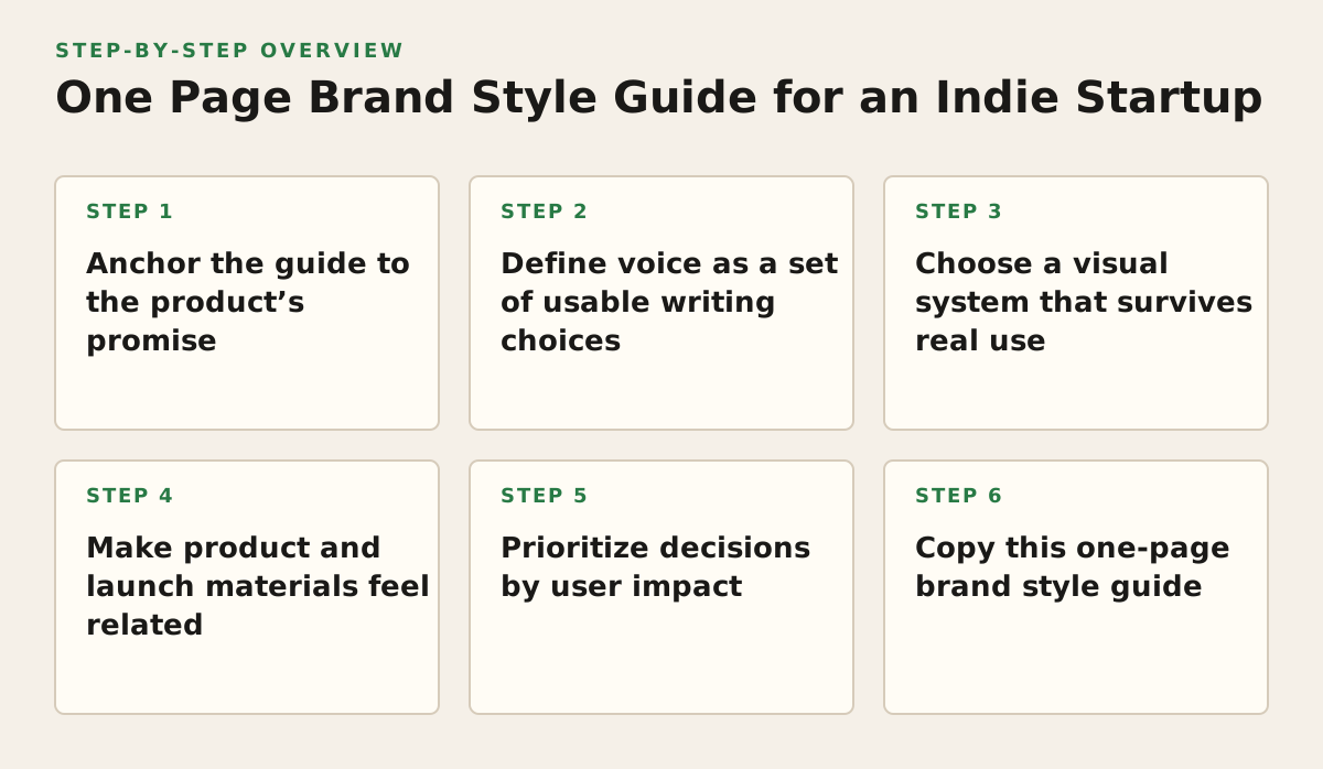
1. Anchor the guide to the product’s promise
When this applies: Start here if your landing page, product interface, and launch description seem to describe different companies—or if teammates use vague words such as “simple,” “powerful,” or “AI-powered” without explaining what users actually get.
A style guide works better when its visual and verbal choices support one recognizable promise. Write down who the product is for, the task it helps them complete, and the outcome they should expect. This is not a mission statement. It is a decision filter: if a design or phrase does not clarify the product’s value to that user, it may not belong in the first version of the guide.
Write a positioning line people can check
Use a plain sentence with a defined audience and job. For example: “LedgerLeaf helps solo consultants prepare client-ready invoices without rebuilding a spreadsheet for every project.” That line gives a founder writing a launch post a clearer starting point than “beautiful invoicing, reimagined.”
Why it works: The promise connects the brand to a concrete user problem, so choices can be evaluated against the product rather than personal taste. Failure mode: Trying to fit every audience, use case, and future feature into one statement. A broad promise gives no useful direction.
- Name the first audience you are trying to reach.
- Describe the task they come to your product to do.
- State the outcome without promising a result you cannot control.
Implementation example: If your product is a feedback inbox for small software teams, your guide might say, “For small product teams who lose customer feedback across channels; bring requests into one place so they can decide what to address.” That boundary can guide the homepage headline, a feature illustration, and the wording of a launch announcement.
2. Define voice as a set of usable writing choices
When this applies: Set voice rules when more than one person writes product copy, or when your launch page sounds bold but your onboarding and support replies sound formal or evasive.
Choose a small number of traits and translate each into observable behavior. “Friendly” alone is difficult to apply. “Use contractions, explain unfamiliar terms, and avoid jokes when describing an error” gives a writer something to do. Separate voice, which remains recognizable, from tone, which can shift with context. Mailchimp’s style guide makes this distinction and provides examples of adjusting tone for different situations: Mailchimp’s voice and tone guidance.
Use examples and counterexamples
For an early-stage project management tool, a voice rule could be “Direct, calm, and practical.” Show what that means:
- Use: “Your weekly plan is ready to review.”
- Avoid: “Your productivity journey starts now!”
- Use in an error: “We couldn’t save this update. Try again, or copy your notes before leaving this page.”
The examples help a founder writing a launch post, a teammate labeling a button, and a support person answering a frustrated customer apply the same voice in different situations. A rule such as “be human” does not give them that help.
Why it works: Concrete examples reduce interpretation while leaving room for new copy. Failure mode: Treating the voice as a script and pasting the same slogan into every context. A celebratory launch post and a failed-payment message should not have identical energy. Implementation example: Keep the core traits fixed, then add one line: “On errors, prioritize clear next steps over wit.”
3. Choose a visual system that survives real use
When this applies: Set basic visual rules before building your launch page, screenshots, social cards, or investor materials. They matter most when those assets are being made by different people or in different tools.
For a first version, define a small palette, a type system, and a logo-use rule. You do not need a unique color for every feature or several display fonts. Choose colors by role—such as page background, body text, primary action, and accent—so a teammate can make a new screen without guessing what each color means. Material Design documents color roles as a way to apply color systematically across an interface: Material Design’s color guidance.
Test contrast, not just appearance
A color combination that looks clear on your monitor may become hard to read in a small button, on a dim display, or when viewed by someone with low vision. The W3C explains contrast requirements for text and provides the minimum contrast ratios for WCAG conformance: Understanding Success Criterion 1.4.3. Treat contrast as a check on the actual foreground and background pair, not as a property of a color by itself.
Why it works: Role-based colors and a limited type system make repeated assets easier to produce and recognize. Failure mode: Selecting a palette from a mood board, then using the accent color for small text or every interface element. Implementation example: Specify “ink for body text, paper for page backgrounds, spruce for primary actions, apricot for occasional highlights,” then check the text-and-background combinations before publishing.
For typography, name the font roles—such as headings, body, and interface labels—and note a fallback. If you use a web font, verify its license and serving terms rather than assuming any downloaded font can be redistributed. Google’s font FAQ explains the open-source licensing of fonts in its catalog: Google Fonts FAQ. Your guide should record the actual font and license source you chose, not merely say “use a modern sans-serif.”
4. Make product and launch materials feel related
When this applies: Use this section when your startup is preparing a public launch, a new feature announcement, or a product demo. A landing page can look polished while screenshots and product labels still feel disconnected from it.
Define a few rules for how the product appears in public. These might cover screenshot framing, whether customer data must be fictional or obscured, how the product name is written, and which interface actions to show. The aim is not to make every asset identical; it is to make each one help a prospective user understand the same product.
Specify the job of each launch asset
Write a short purpose for each common format:
- Landing-page hero: show the audience, job, and next action.
- Product screenshot: show one workflow that supports the promise, not an entire dashboard at unreadable scale.
- Launch post: explain the problem, what the product does, and who should try it.
- Demo: show a realistic task from start to finish, including any important limitation.
Why it works: Giving an asset a communication job keeps visuals from becoming decoration and copy from making unsupported claims. Failure mode: Showing a crowded dashboard because it contains many features, even though a new visitor cannot tell where to look. Implementation example: For an early-stage scheduling tool, use a screenshot that follows one booking from request to confirmation; save settings screens for a later explanation.
If you are preparing a public debut, the guide can also serve as the review checklist for the page where you submit your product launch. Check the product name, one-sentence promise, screenshots, and launch copy against the same rules before submitting.
5. Prioritize decisions by user impact
When this applies: Use a prioritization rule when you have more possible brand decisions than time. Early founders often spend too long debating details that users will barely notice while leaving confusing product language unresolved.
Score a decision by asking whether it affects comprehension, trust, or consistency in a high-visibility place. This is a practical sorting method, not a claim that every design choice can be measured precisely. Fix the issues that could make a visitor misunderstand the product or doubt the next step before polishing lower-impact decoration.
| Decision area | Prioritize when | Quick check | Example |
|---|---|---|---|
| Product promise | A new visitor cannot tell who it is for or what it does | Can a target user paraphrase the offer? | Replace a vague headline with the audience and job |
| Action language | A button or instruction could be misunderstood | Does the label describe what happens next? | Use “Create your first workspace” instead of “Continue” when appropriate |
| Text contrast | Text is small, prominent, or placed over a colored surface | Check the actual foreground and background pair | Use a readable text color on the primary button |
| Decorative detail | The core page is clear and consistent | Does the detail help explain or identify the product? | Refine an illustration after the workflow is understandable |
Why it works: The framework directs scarce founder time toward decisions that can change how quickly someone understands or trusts the product. Failure mode: Treating the table as a permanent ranking; a decorative detail may matter if it becomes the product’s main identifier. Implementation example: Before a launch, list the homepage headline, primary button, and first screenshot as review items. Leave secondary icon polish for later unless it blocks comprehension.
6. Copy this one-page brand style guide
Use this as the actual working document, not a prompt to make a longer brand book. Fill in every line that affects the next launch or product surface; mark an unresolved choice as “test” rather than quietly letting different teammates invent different answers. Keep it in the workspace where the team edits launch copy and product materials.
ONE-PAGE BRAND STYLE GUIDE — [PRODUCT NAME]
Product promise: We help [first audience] do [specific job] so they can [realistic outcome].
Audience we prioritize now: [Who is the first user?]
Voice: [Three traits, such as direct, calm, practical.]
Write like this: [One example sentence that fits.]
Avoid: [One phrase, tone, or claim that does not fit.]
Visual roles: Background [color]; body text [color]; primary action [color]; accent [color].
Typography: Headings [font]; body and interface [font]; fallback [font or system stack].
Logo and product name: Write the name as [exact spelling and capitalization]. Use the logo [approved version or location].
Launch assets: Show [workflow or outcome]. Use [screenshot or image rule]. Do not show [private, misleading, or irrelevant material].
Accessibility check: Check text contrast on each background; verify labels and text are readable at the size used.
Before publishing: Confirm the audience, promise, product name, action label, screenshot, and claims match this page.
Owner and review trigger: [Person responsible]; revisit when [audience, product promise, or visual system changes].
Why it works: The template places the decisions a founder repeatedly needs in one scan-friendly place. Failure mode: Filling every blank with broad adjectives or hypothetical future positioning. Implementation example: A fictional product named Patchwork could write, “We help small software teams collect scattered customer requests so they can review them together.” Its launch asset rule might be “Show one request moving from inbox to a prioritized list; use sample customer names.” That is more actionable than “Make it modern and trustworthy.”
7. Put the guide into the team’s working routine
A guide has little value if it is created once and then ignored. Make it the reference for recurring work: a landing-page edit, a new onboarding step, a product screenshot, or a founder-written launch update. Assign one person to resolve conflicts so two competing versions do not emerge in the shared document.
Why it works: A lightweight review habit catches drift while assets are still easy to change. Failure mode: Reopening settled choices for every small asset, turning a guide into an approval bottleneck. Implementation example: Let teammates make routine copy and layout decisions independently when they fit the guide; ask the owner to review only a proposed change to the promise, core palette, or voice.
Use one question to decide whether to revise
Revise the guide when the product or audience changes, or when the same mismatch keeps appearing in real work. Do not add a rule to solve a one-off preference. Keep a short change note—what changed and why—so the next person understands whether a decision is current or simply an old draft.
Implementation plan: make the guide usable before launch
- Write the promise first. Name the first audience, job, and realistic outcome. Remove claims the product cannot currently support.
- Set the minimum voice and visual rules. Choose a few traits with examples, assign colors by role, specify font choices, and check text contrast.
- Apply the rules to three real assets. Review a landing-page section, one product screenshot, and a launch post. Fix inconsistencies that could confuse a prospective user.
- Paste the template into the team workspace. Replace the blanks with current decisions, name an owner, and identify the event that should trigger review.
- Use it during the next launch review. Check the promise, product name, action labels, screenshots, and claims—not subjective polish alone. Update only rules that caused a real ambiguity or no longer fit the product.
Keep the guide short enough to consult while shipping, and specific enough that another founder can use it without guessing. SuperPublic helps early-stage founders share product launches and discover other indie products; explore what the community is building at SuperPublic.
Authored with NotFair SEO