Founder field note
Indie Launch Page Checklist: 7 Steps to Turn Visits Into Useful Actions
Use this indie launch page checklist to clarify your promise, remove signup friction, instrument feedback, and turn launch visits into useful next steps.
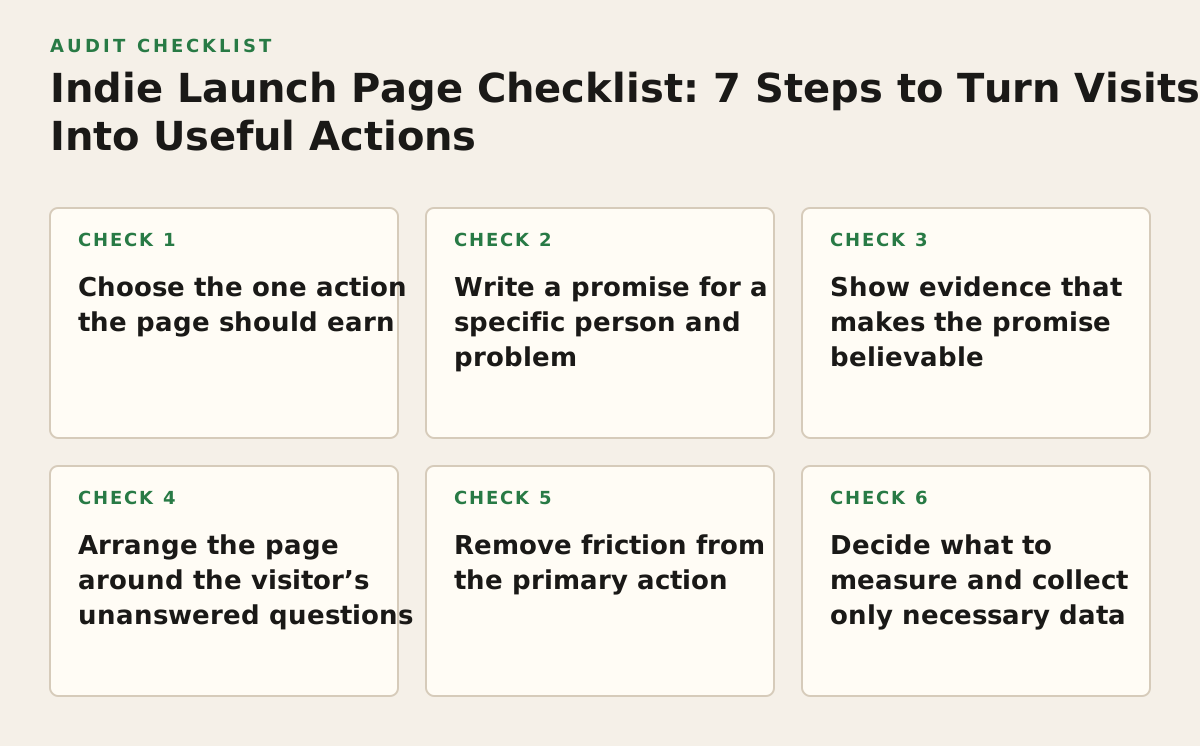
An indie launch page checklist should help a bootstrapped founder or early-stage team turn a first visit into one clear next action: try the product, join a waitlist, or start a conversation. Work through these seven steps in order to make the page understandable, credible, usable, and ready to learn from—without pretending you have traction or features you do not.
Step 1: Choose the one action the page should earn
Decide what a well-matched visitor should do before writing headlines or choosing a template. A page can link to secondary information, but it should have one primary action that fits the product’s stage. A working product might invite visitors to try it; a private beta might collect qualified requests; a product still being shaped might ask for a conversation.
Match the action to the product’s readiness
- Available now: Send visitors to the shortest honest path to trying or buying the product.
- Limited release: Explain what happens after someone requests access, including any manual review or wait.
- Problem discovery: Ask for a specific conversation or feedback, rather than implying the product is ready if it is not.
Do not make “Join the waitlist,” “Book a demo,” and “Start free” equally prominent unless visitors genuinely need to choose among different paths. Each extra choice asks people to interpret your launch strategy instead of deciding whether your product fits them.
Step 2: Write a promise for a specific person and problem
Use the first screen to answer three questions: Who is this for? What task does it help with? What should the visitor do next? A clear formula is: “For [specific user], [product] helps [task or problem] without [relevant friction].” Treat it as a drafting tool, not a slogan you must publish unchanged.
For example, a hypothetical changelog tool called Patchlog could say: “A simpler way for small software teams to publish product updates.” That is more useful to a likely buyer than “The future of product communication,” because it names a product category and audience. If Patchlog does not yet support a claimed workflow, leave that claim out.
Check the wording against the actual product
Read the headline alongside the product itself. If a visitor cannot connect the promise to the current interface or available workflow, narrow the claim. Google’s Search guidance recommends helpful content and descriptive titles; its SEO Starter Guide is also a useful reminder to make page wording understandable to people, not just search engines.
- Name the audience in terms they use, not an invented market category.
- Describe a job or pain point the product actually addresses.
- Use a supporting line for an important constraint, such as beta access or a required setup.
Step 3: Show evidence that makes the promise believable
Give visitors something concrete to inspect: a product screenshot, a short interface walkthrough, a sample output, or a real use case. Show the product in context rather than filling the page with abstract claims. For Patchlog, that might mean a sample update as a reader sees it, paired with the screen where a founder drafts it.
Label demonstrations accurately. If a screenshot uses sample data, say so. If a feature is planned rather than available, identify it as planned or omit it from the launch page. Do not invent customer quotes, usage figures, integrations, security certifications, or performance improvements to make an early product look established.
Make product visuals usable, not merely attractive
Write a short description for meaningful images and make sure controls have clear labels. The W3C’s WCAG quick reference covers text alternatives for non-text content and labels or instructions for user inputs. Those practices help visitors understand visuals and forms when they cannot rely on sight alone.
Step 4: Arrange the page around the visitor’s unanswered questions
Put information in the order a prospective user needs it: what the product does, who it serves, how it works, what is available now, and what happens after the main action. A short page can answer these questions without adding a section for every possible feature. Use each section to resolve one objection, not repeat the headline in new words.
| Visitor question | Useful page element | Patchlog example |
|---|---|---|
| What is this? | Specific headline and plain-language explanation | A changelog tool for small software teams |
| How would I use it? | Screenshot, short walkthrough, or sample output | A draft update next to its published view |
| Is it ready for me? | Accurate availability and limitations | State whether access is open or requires a request |
| What happens if I act? | Clear CTA and next-step explanation | Explain what follows a beta-access request |
Keep objections specific to your product. A developer tool may need to explain setup; a service aimed at nontechnical teams may need to show the workflow without assuming coding knowledge. If an answer is important to deciding whether to sign up, do not hide it behind a vague “Learn more” link.
Step 5: Remove friction from the primary action
Make the button’s wording match the outcome: “Request beta access” should lead to a request, while “Try the product” should lead to a usable product experience. Ask only for information you need to take the next step. If a name and email are enough to reply to a beta request, requiring a long profile or a call booking may discourage otherwise relevant users.
Check the page on a phone as well as a desktop. Confirm that the headline is visible, the CTA is easy to reach, text is readable, and form fields can be completed without awkward zooming or horizontal scrolling. If the CTA opens a form or a new page, make the transition obvious and preserve the context of the offer.
- Use a button label that describes the next action.
- Explain required fields and what happens after submission.
- Provide a visible confirmation after the form is sent.
- Test keyboard navigation and meaningful labels, not only visual appearance.
Step 6: Decide what to measure and collect only necessary data
Choose a small set of signals before launch: visits to the page, clicks on the primary action, completed signups or requests, and the questions people ask afterward. Separate attention from intent: a page visit shows exposure, while a completed request shows someone was willing to take a next step. Neither alone proves product-market fit.
If you use Google Analytics, its documentation explains how events can record interactions such as clicks and submissions; see Google’s event setup guidance. Keep event names and definitions understandable to whoever will review them. You can also track a simple manual count if analytics setup would delay a small launch.
Set a modest starting policy, then adjust to the signal
As an illustrative starting policy, review page visits, primary-action clicks, and completed submissions once a week during the first launch period. This is a review cadence, not a universal benchmark. If traffic is too sparse to reveal a pattern, keep collecting observations or invite direct feedback; if visitors click but do not finish, inspect the form and the promise around it. If people arrive but do not click, revisit audience fit and clarity before adding more traffic.
Collect only information needed to deliver the promised next step, and explain how you will use it. The FTC’s business guidance on protecting personal information advises businesses to consider what data they collect and protect the information they retain. Avoid asking launch visitors for sensitive details when a short feedback conversation will do.
Step 7: First, ask target users to explain the page back to you
Before promoting the page, show it to people who resemble the intended users and ask: “What does this product do?”, “Who do you think it is for?”, and “What would you expect after clicking the button?” Listen for mismatches between your intended promise and their interpretation. Do not lead them toward the answer you hope to hear.
As an illustrative starting policy, ask three relevant people to review the page before making a revision. Treat that number as a practical first check, not a proof threshold; increase the sample or seek a different audience if their answers conflict or do not represent likely users. Fix misunderstandings that could lead to a wrong expectation, then publish and learn from real actions.
When the page is ready, submit your product launch to help early adopters discover it. SuperPublic is built for bootstrapped, pre-seed, and angel-funded products seeking visibility and founder connections; explore the community at SuperPublic.
Authored with NotFair SEO