Founder field note
Early-stage Product Popularity Comparison: A Practical Framework for Founders
Use an early-stage product popularity comparison to separate real traction from launch-day noise with a practical scorecard for founders and investors.
An early-stage product popularity comparison should rank products by comparable evidence of attention, activation, retention, and commercial intent—not by raw follower counts or a single launch-day spike. For a bootstrapped or pre-seed founder, the most useful comparison is a dated scorecard that separates discovery from product usage: qualified visits, sign-ups, activated users, returning users, meaningful feedback, and revenue signals. That approach helps you decide what to promote, what to improve, and which apparently popular products deserve a closer look.
What an Early-stage Product Popularity Comparison actually measures
“Popularity” is an ambiguous word when products are young. A consumer utility can attract many casual visitors, while a specialist B2B tool may have fewer visitors but stronger activation and paid intent. Comparing the two on traffic alone produces a neat ranking with little decision value.
A useful comparison treats popularity as a set of observable signals rather than a permanent product attribute. The signals should answer four different questions:
- Reach: How many relevant people encountered the product?
- Interest: How many understood the promise well enough to click, visit, or sign up?
- Value: How many completed the product’s first meaningful action?
- Momentum: Are those signals improving, repeating, or disappearing after the initial launch?
These dimensions must remain separate. A product can have high reach and weak interest because its post is broadly shared but poorly targeted. It can have modest reach and strong value because a narrow audience has an urgent problem. It can have strong sign-ups and weak momentum if most accounts never return.
The comparison unit matters
Illustrative example: Compare products over the same time window, audience type, and measurement definition. “Last 30 days” is more useful than “since launch” when one product launched six months ago and another launched last week. If you cannot get equal windows, label the comparison as directional rather than definitive.
Also define what counts as a user. A visitor, registered account, activated workspace, paying customer, and retained user are different units. A founder comparing “users” without defining the term may accidentally compare page views from one product with active teams from another.
Popularity is not the same as quality
A popularity comparison can tell you which products are attracting attention or engagement. It cannot, by itself, prove product quality, profitability, defensibility, or customer satisfaction. Those require additional evidence such as retention cohorts, customer interviews, support patterns, gross margin, or renewal behavior.
For investors and early adopters, this distinction prevents a common mistake: treating visible distribution as proof of a durable business. For founders, it prevents optimizing for applause when the real job is to create repeated user value.
Why the comparison matters for early-stage teams
Young products rarely have enough history for mature-company benchmarks to be useful. Their data is sparse, channels are uneven, and one mention can distort a week. A structured comparison gives a founder a way to make decisions with incomplete evidence without pretending the evidence is stronger than it is.
The first benefit is channel diagnosis. Suppose Product A receives 4,000 launch-page visits and 80 sign-ups, while Product B receives 900 visits and 120 sign-ups. Product A has greater reach; Product B has a stronger visit-to-sign-up rate. The right response is not automatically to copy A’s distribution. B may have clearer positioning or a more urgent audience, while A may need landing-page or targeting work.
The second benefit is resource allocation. A founder can decide whether the next week should go toward:
- creating more distribution assets because qualified reach is too low;
- rewriting the landing page because visits are not becoming sign-ups;
- improving onboarding because sign-ups do not reach the first value event;
- interviewing users because activation is high but repeat usage is weak; or
- building sales follow-up because usage is strong but purchase intent is unclear.
The third benefit is better discovery for early adopters. A buyer does not necessarily want the product with the loudest launch. They may prefer the tool showing a smaller but more relevant audience, clear documentation, responsive founders, and evidence that users return to solve the same problem.
In 2026, analytics also make it easier to separate acquisition events from product events. Google’s GA4 documentation describes events as interactions that can be collected and analyzed, which supports defining product-specific actions rather than relying only on page views (Google Analytics event documentation). The practical implication is simple: record the action that represents value for your product, not just the action that is easiest to count.
How to build a defensible popularity scorecard
A comparison becomes useful when every product is evaluated with the same fields and each field has a stated definition. Start with a compact table rather than a complicated scoring model.
| Dimension | Example measure | What it can indicate | Primary risk |
|---|---|---|---|
| Reach | Qualified landing-page visits | Distribution and audience exposure | Low-intent or duplicated traffic |
| Interest | Visit-to-sign-up rate | Message and problem relevance | Weak or inconsistent definitions |
| Activation | Users completing the first value event | Onboarding and initial usefulness | Event may be too easy or too late |
| Retention | Users returning within a defined period | Repeat value or habit formation | Short windows can mislead |
| Intent | Demo requests, paid trials, or purchases | Commercial relevance | Small samples and founder-led sales effects |
Choose denominators before looking at results
Rates are often more informative than totals, but only when the denominator is stable. Define whether activation is activated users divided by sign-ups, or activated users divided by unique visitors. Both can be valid; they answer different questions. Write the formula down before comparing products.
For an illustrative starting policy, a founder could track the following for each product during the same 14-day window:
- 1,000 qualified visits, 70 sign-ups, 35 activated users, and 14 returning users.
- Calculate 7% visit-to-sign-up, 50% sign-up-to-activation, and 40% activation-to-return.
- Record the acquisition source and audience segment beside each number.
- Mark any metric with fewer than 20 observations as directional rather than conclusive.
The numbers above are an illustrative measurement policy, not a universal benchmark. A developer tool, an AI writing assistant, and a team billing platform may have different natural usage cycles. The point is consistency and transparency.
Use a weighted score only after preserving the raw data
A single score is convenient for sorting, but it hides trade-offs. If you create one, publish the components beside it. An illustrative starting model might assign 20% to qualified reach, 20% to interest, 30% to activation, 20% to repeat usage, and 10% to commercial intent. Those weights are a policy choice, not an objective truth.
Never let a high-volume metric overwhelm a high-value metric simply because its numbers are larger. Normalize each measure against a comparison group or use rates before applying weights. Keep the raw totals visible so a founder can challenge the interpretation.
Analytics platforms can also differ in attribution and identity handling. Google’s documentation for the Search Console Performance report distinguishes dimensions and metrics such as queries, pages, clicks, impressions, click-through rate, and position (Google Search Console Performance report). Search visibility is therefore useful evidence of discoverability, but it should not be presented as equivalent to product activation or revenue.
Where popularity comparisons break
The biggest failure is confusing exposure with demand. A product may be mentioned by a large account, appear in a newsletter, or receive a burst of curiosity from an unrelated audience. Those visits matter for awareness, but they do not establish that the intended customer has a problem worth solving.
The second failure is comparing different product categories without adjusting the question. A free browser extension may be expected to convert visitors quickly, while enterprise software may require a conversation, security review, and multiple stakeholders. The same conversion-rate ranking would punish the enterprise product for having a longer buying process.
Other common distortions include:
- Launch timing: a product released yesterday has less opportunity to accumulate returning users than one available for months.
- Audience size: a broad consumer category can generate more visits than a narrow professional category even when the latter has stronger customer fit.
- Founder activity: manual outreach can inflate early sign-ups without proving scalable acquisition.
- Tracking gaps: consent settings, ad blockers, cross-device behavior, and missing event instrumentation can make products appear less active than they are.
- Duplicate accounts: a sign-up count may include trial accounts, test users, or people registering more than once.
Search metrics have their own limitations. Search Console reports search performance, not every source of product discovery, and Google notes that some data may be aggregated or omitted in reporting for privacy and data-protection reasons (Google Search Console data privacy guidance). Treat missing query detail as a limitation of the dataset, not evidence that demand does not exist.
Small samples require humility
When a product has 12 sign-ups, one additional activation changes the rate substantially. A leaderboard can make random variation look like a strategic advantage. Use labels such as “early signal,” “directional,” or “insufficient evidence,” and report counts next to percentages.
Do not publish a precise rank when the products are separated by noise. A sensible output may be a tiered comparison:
- Emerging signal: attention is present, but usage evidence is still thin.
- Promising engagement: the intended audience is taking the first meaningful action.
- Repeat-use evidence: users return or continue a workflow over the chosen period.
- Commercial evidence: there is observable purchase, renewal, or qualified buying intent.
This format is less dramatic than a one-to-20 ranking, but it is more actionable and harder to manipulate.
How practitioners apply the comparison
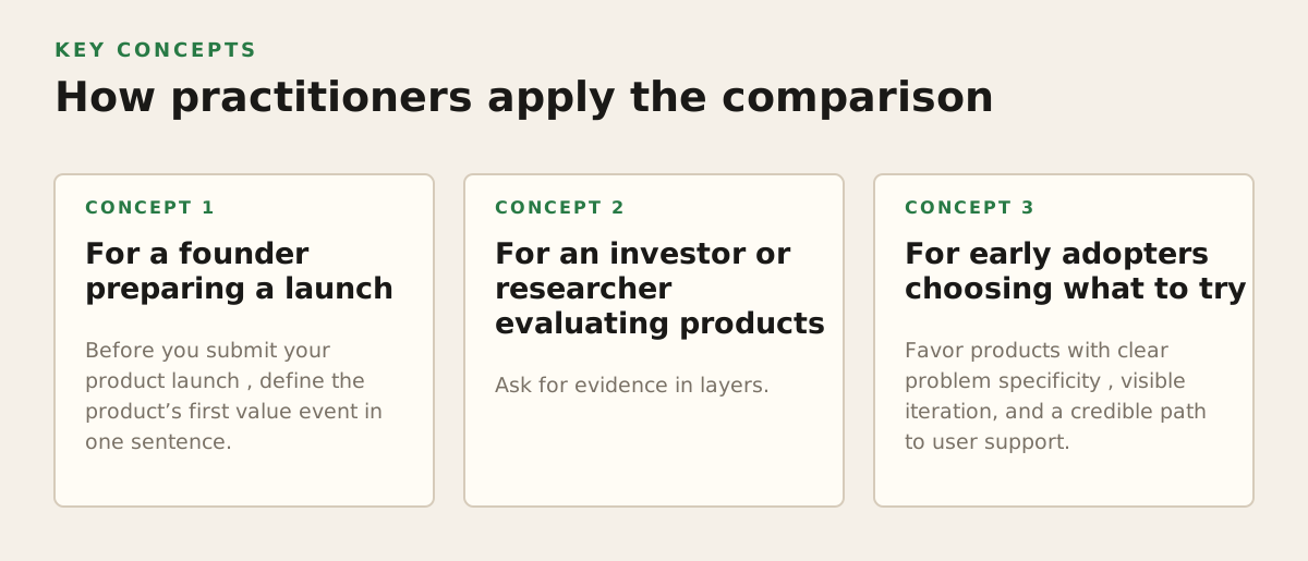
A founder should use the scorecard as a decision tool, not as a vanity report. Set a review date, capture a baseline, and choose one intervention linked to the weakest meaningful stage.
For a founder preparing a launch
Before you submit your product launch, define the product’s first value event in one sentence. For a meeting assistant, it might be creating a usable meeting summary. For a budgeting tool, it might be connecting a data source and viewing a categorized result. This definition lets you compare attention with actual progress toward value.
Prepare a simple launch record containing:
- the intended audience and problem;
- the comparison period and launch date;
- the main acquisition sources;
- the sign-up and activation definitions;
- the next action if reach, activation, or retention is weak.
After the launch, avoid changing the definition merely because the first result is disappointing. Change the product, message, or channel; preserve the measurement rule long enough to learn whether the intervention worked.
For an investor or researcher evaluating products
Ask for evidence in layers. Start with the public product page and positioning. Then look for a clear activation event, repeat usage, customer proof, and commercial intent. If the founder cannot share numbers, ask qualitative questions that reveal the mechanism: Who returns? What do they do on the second visit? What causes them to stop? Which channel produces the best-fit users?
Useful questions include:
- Which audience segment has the highest activation rate?
- What percentage of sign-ups completed the first value event during the stated period?
- What behavior counts as retention for this product?
- Which acquisition source produces conversations or payments rather than just visits?
- What evidence would change the team’s current growth hypothesis?
For public comparisons, date every observation. A product’s popularity is a moving state, not a permanent label. A 2026 snapshot should say when it was collected, what was measured, and what was unavailable.
For early adopters choosing what to try
Favor products with clear problem specificity, visible iteration, and a credible path to user support. A smaller product may be a better early-adopter choice if the founder is responsive and the workflow fits your needs. Popularity is a filter for attention; it is not a substitute for product fit.
For SuperPublic’s founder community, the practical recommendation is to use a transparent scorecard when launching or researching emerging software: show the signal, define the denominator, date the observation, and state the limitation. SuperPublic gives bootstrapped, pre-seed, and angel-funded founders a place to submit launches, gain visibility, and discover other early-stage products through SuperPublic.
Authored with NotFair SEO